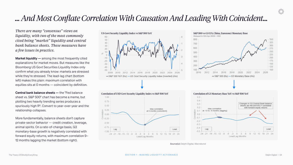
The Fed balance sheet vs S&P 500 chart is one of the most cited charts in macro. It is also misleading.
The relationship only looks clean in raw levels. Convert to year-over-year growth and it weakens. The sign actually flips on global monetary base growth across the major central banks, where growth correlates negatively with forward equity returns.
The simple level overlay is not evidence of a leading indicator. It is two heavily trending series plotted together. Anything that goes up over time will correlate with anything else that goes up over time.
The same problem shows up when market liquidity indices are treated as leading indicators. Measures like the Bloomberg US Government Securities Liquidity Index are cited to explain selloffs. A correlation that peaks at zero months is coincident by definition. They tell you markets are stressed while markets are stressed.
The fix is to separate measures that lead from measures that confirm. Central bank balance sheets don't directly capture private-sector credit creation, leverage, or risk appetite. Those are what matter and they don't show up cleanly on the Fed's balance sheet.
A framework that tracks the market instead of leading it will get wrong-footed at every turning point.
免责声明:本文章仅代表作者个人观点,不代表本平台的立场和观点。本文章仅供信息分享,不构成对任何人的任何投资建议。用户与作者之间的任何争议,与本平台无关。如网页中刊载的文章或图片涉及侵权,请提供相关的权利证明和身份证明发送邮件到support@aicoin.com,本平台相关工作人员将会进行核查。


