Last time during the live stream, many friends were asking how to use the chip distribution, saying they were envious of others who could catch the market trends with it. Alright, in this episode, I will break down and explain the usage of this "market analysis tool" in detail!
Let's start with two charts to see the current market conditions for Bitcoin and Ethereum.
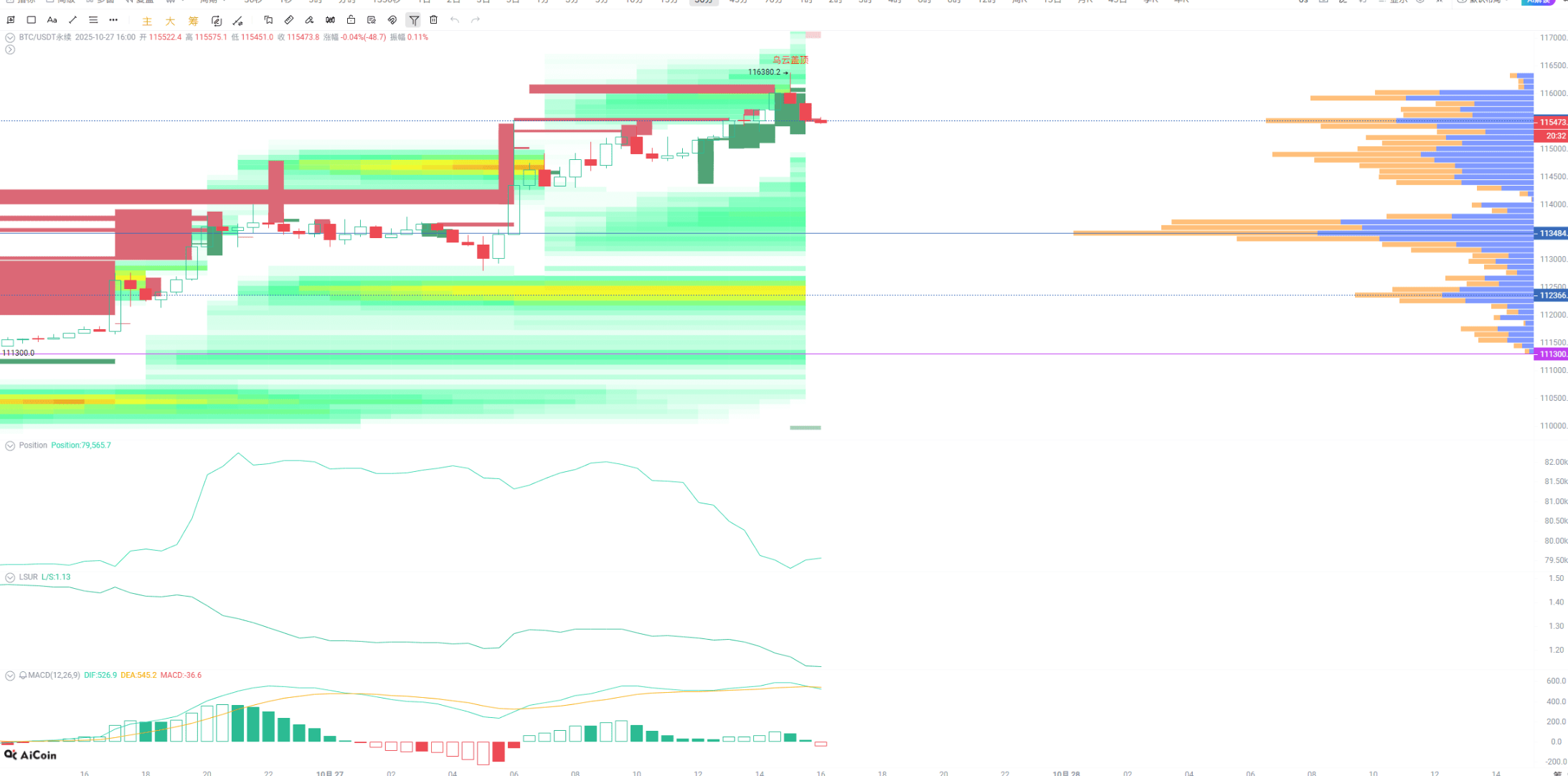
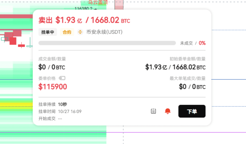
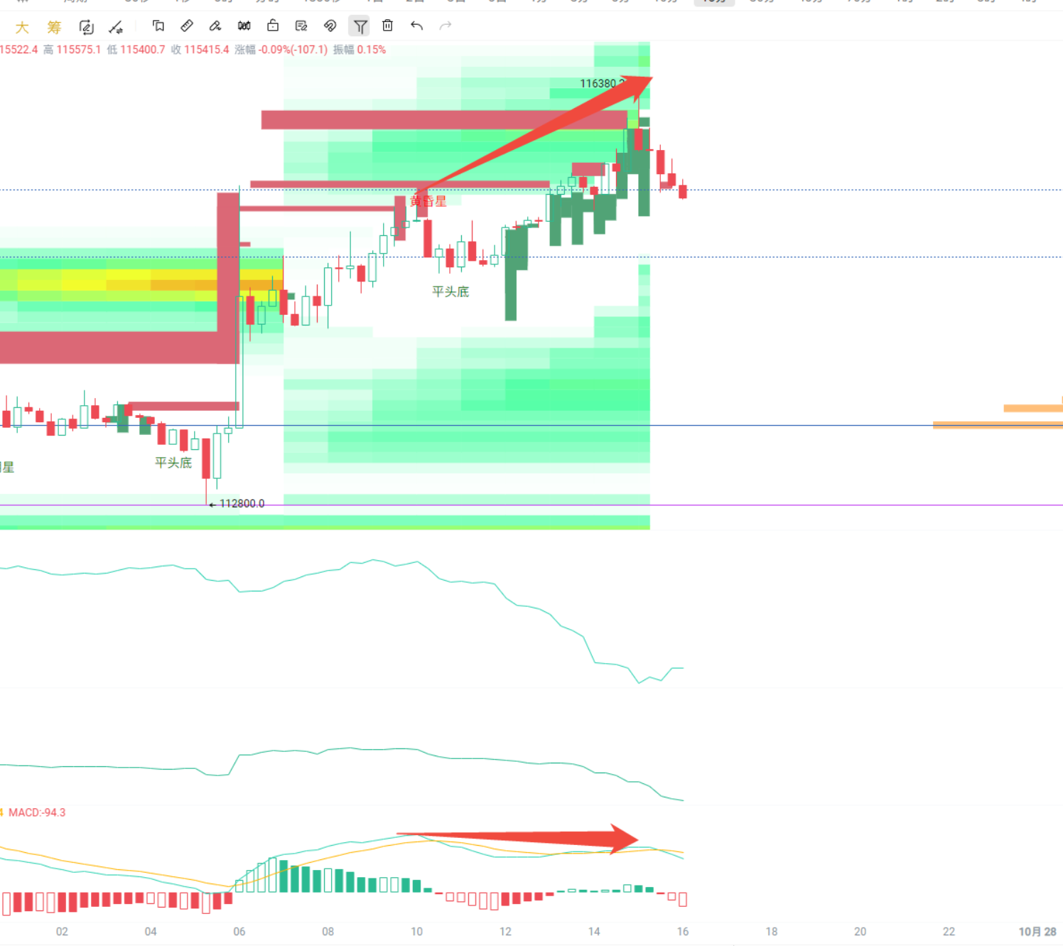
Focus on this one! The main force has dumped over a hundred million dollars in large orders; this signal cannot be hidden.
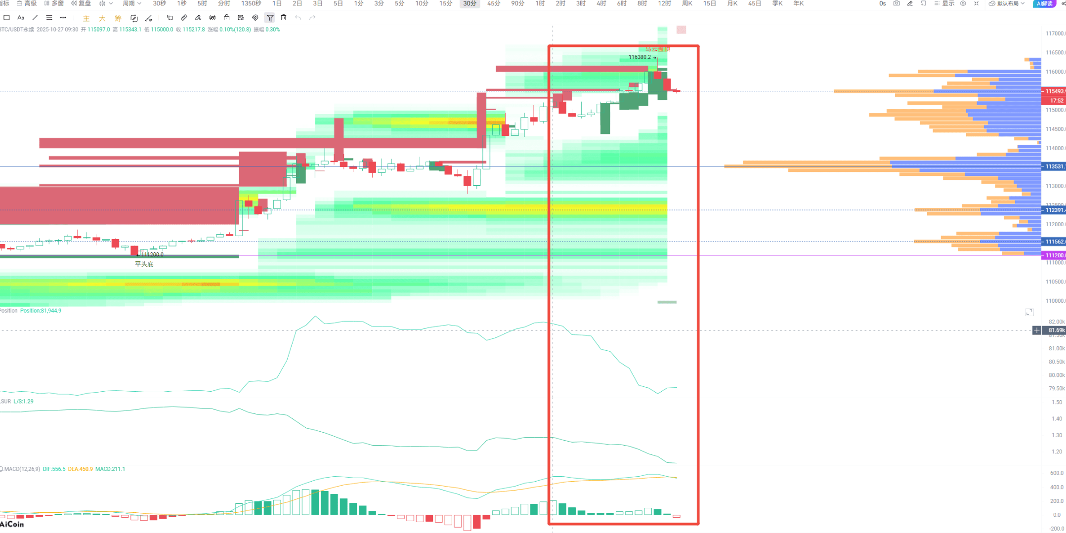
By the way, do you remember the usage of the open interest + LSUR indicator that I explained in the last two live streams? Now these two indicators just happen to align with the pattern we discussed — price increase + decrease in open interest + decline in LSUR. This indicates that some people have quietly closed their positions and left during this small rise, so don’t foolishly chase after it.
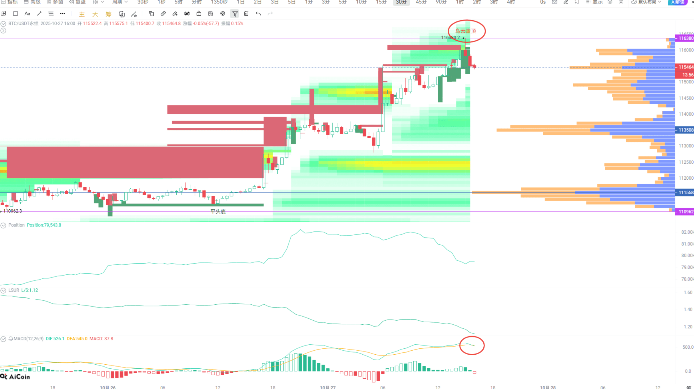
Not to mention that the MACD has already signaled at a high position, with a short-term divergence, and combined with this "dark cloud cover" pattern, it’s all a warning sign saying "don’t chase the rise," as the risk of falling into a pit is too high. In fact, it can be seen from the open interest not rising along with the price; as I mentioned before, if the price rises but the open interest does not follow, it means that existing funds are holding up, and it’s not new money coming in, so the upward trend won’t last long.
For those who want to further understand the usage of open interest, just check the replays of my last two live streams; all the valuable information is in there.
In contrast, Ethereum looks much more stable: price increase + volume increase + LSUR decrease, this is a healthy upward trend — new positions are continuously being added, indicating that new funds are indeed entering the market. Moreover, there are many pending orders piled up near the current price, especially in this range, which needs to be closely monitored. The proximity to the current price, the density of chips, and a bunch of large orders stacked together indicate the main force's movements are all here.
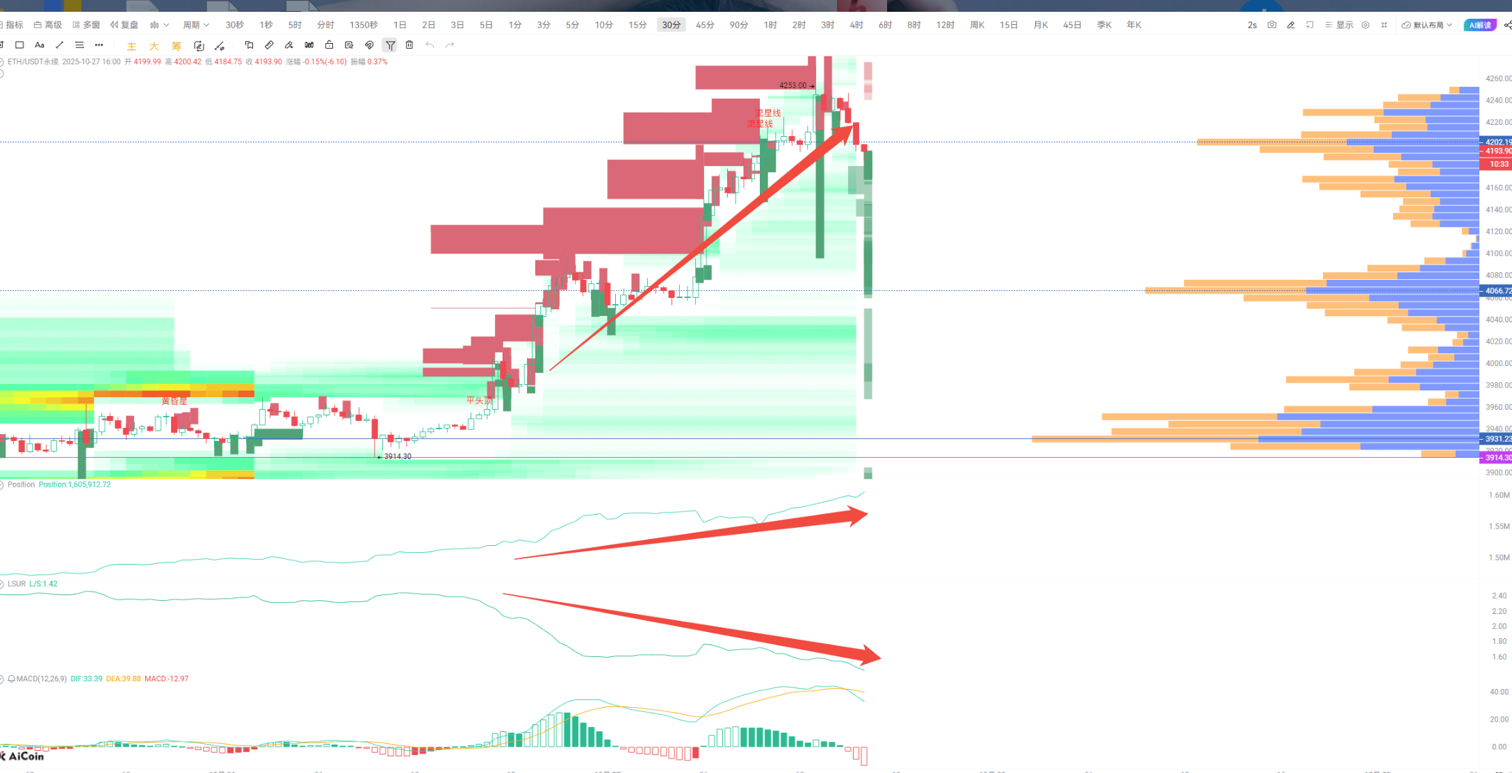
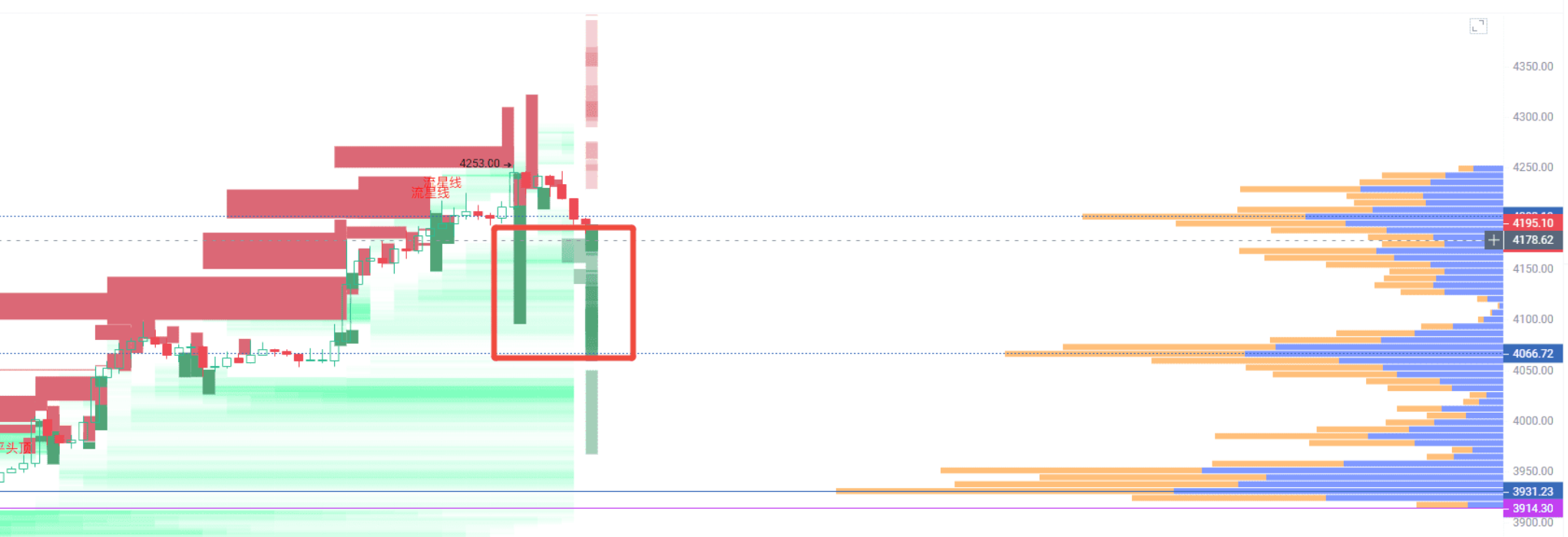
At this point, we need to introduce today’s main characters — open interest and chip distribution. Buy and sell orders are all hanging there, but until they are executed, no one can tell whether they are opening or closing positions. Ethereum's lowest price touched 4110, and looking at the chip peak, the support area is between 4066 and 4110. Just a reminder, any mainstream coin that shows over 10 million in pending orders and can hold for over an hour should be closely monitored; the main force is likely making moves.
Talking without practice is just empty talk; let’s first look at a chart to familiarize ourselves with what a chip distribution chart looks like.
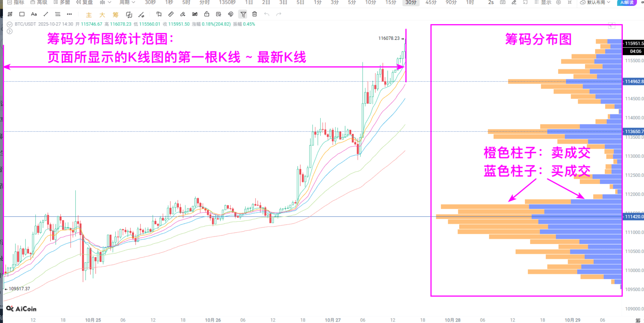
Behind every transaction, there is a corresponding price and open interest. This chart is actually very easy to understand; it simply stacks the transaction volume of different price ranges together. The more transactions there are, the taller the bar, making it clear at a glance.
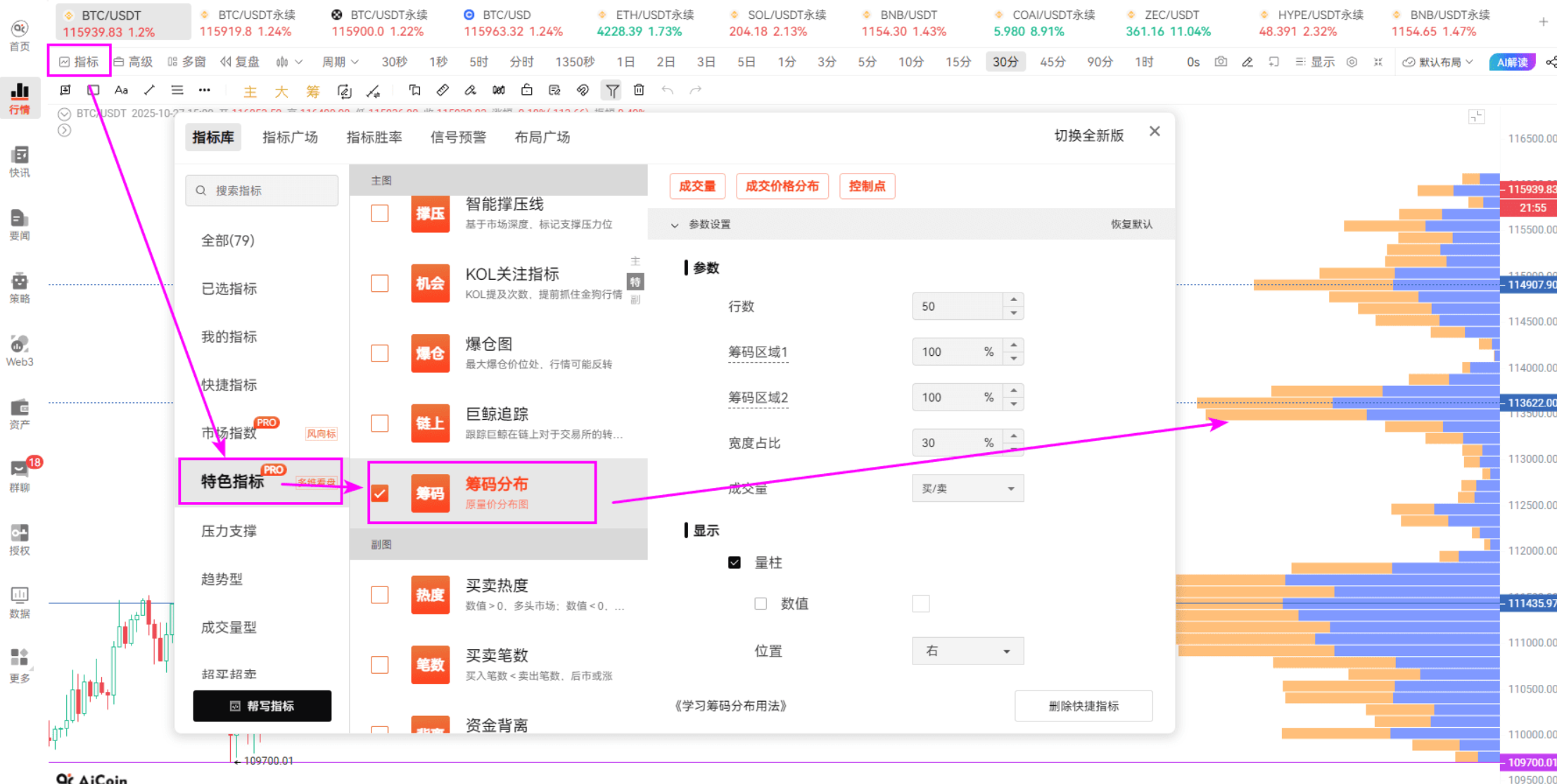
I personally prefer to look at historical transactions alongside the latest transactions. If you only look at historical data, you need to use the chip tool to find the chip peak — which is the longest bar in the area.
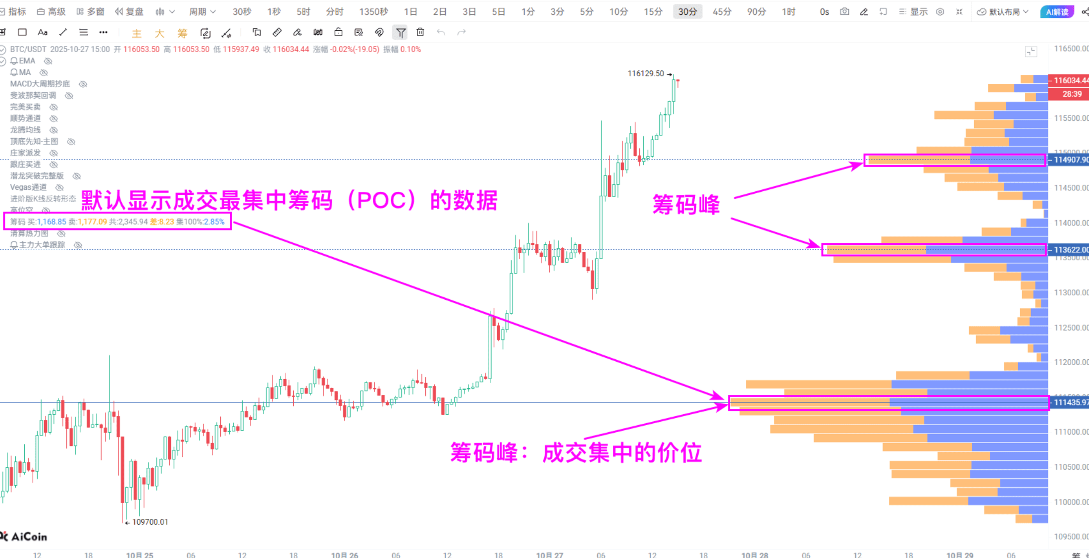
Generally speaking, if the chip peak is above the price, it indicates a resistance level; if it’s below, it indicates a support level.
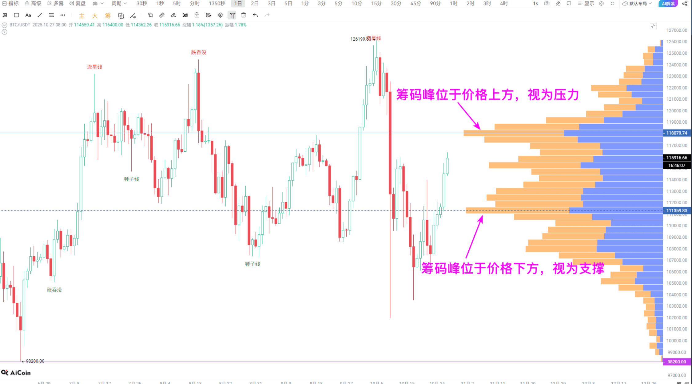
Here’s a little advanced tip: if the chip peak is below the price, it’s a support level — as long as it doesn’t break, the price is likely to rebound; once it breaks, the market may accelerate its decline. If it’s above the price, it’s a resistance level — if it doesn’t break through, it’s easy to pull back, but once it breaks through, the upward speed can be very fast.
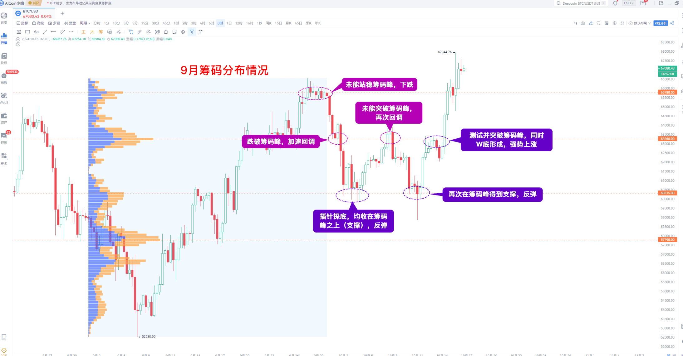
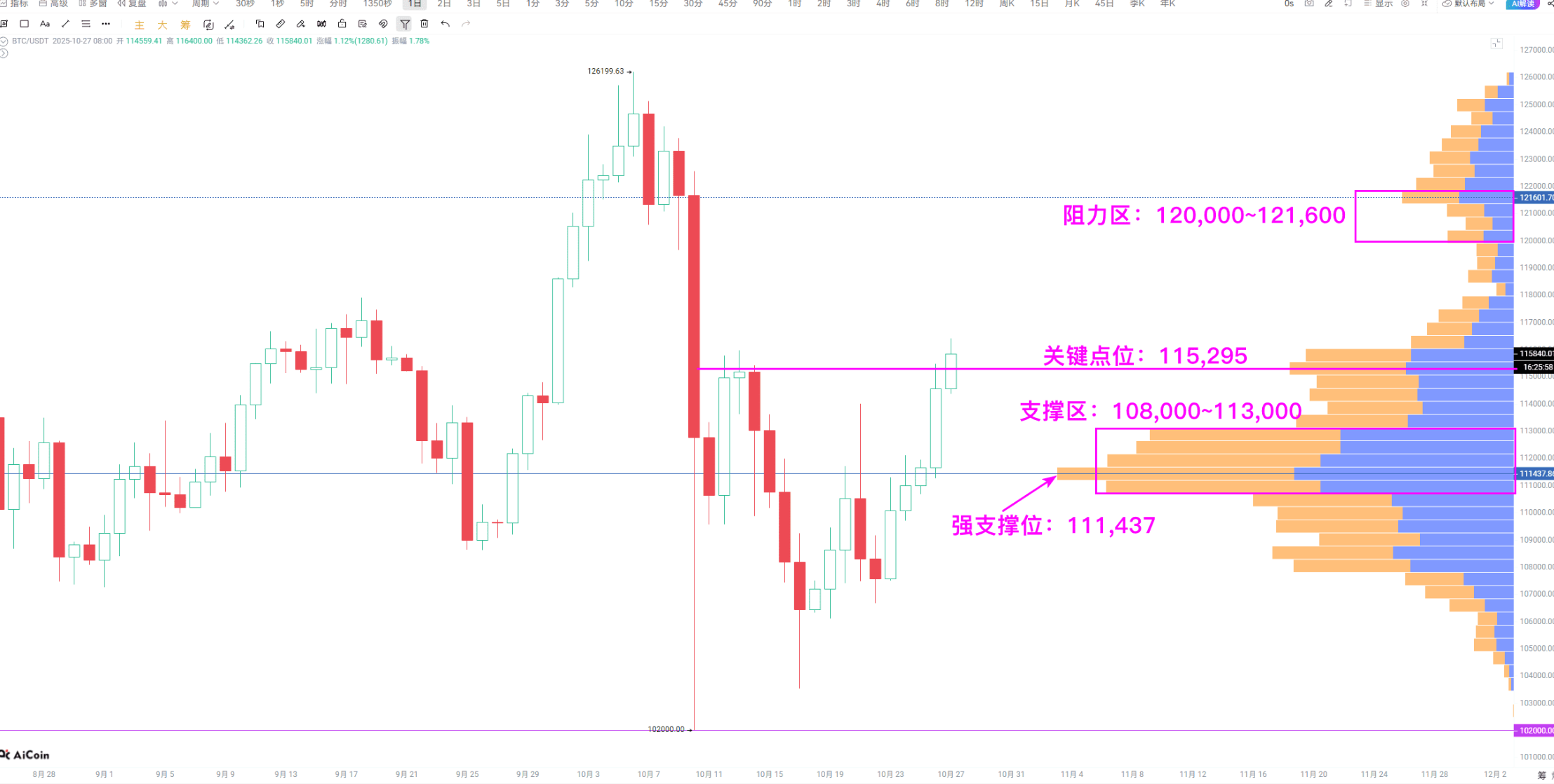
Looking at this chart I posted before, you can understand it. According to this method, looking at BTC's chip data over the last three months, the support area is between 108000 and 113000, while the resistance is capped at 120000 to 121600.
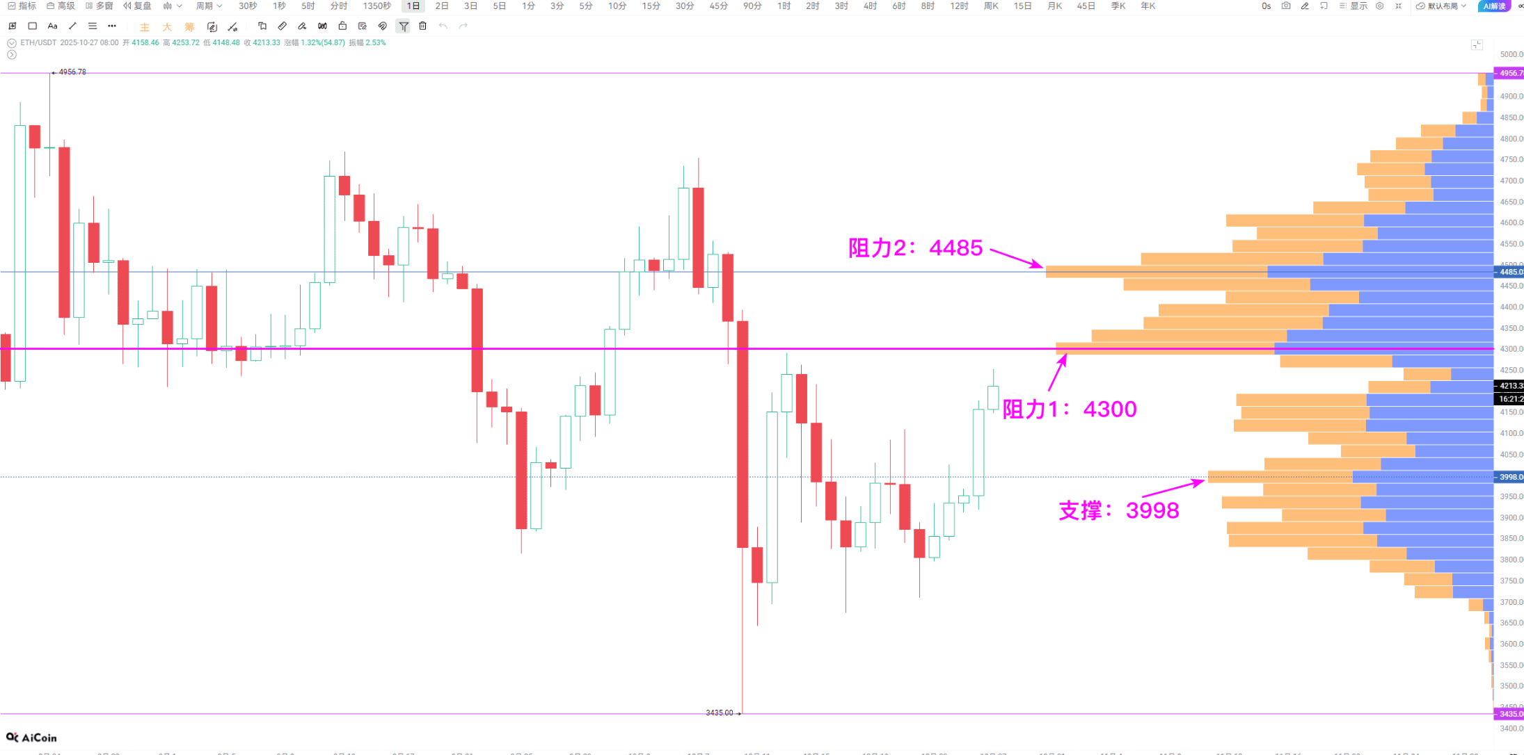
ETH is the same; the key resistance is at 4300, and above that is 4485. If it can break through these two points, the upward speed will definitely be fast, as most of the chips are piled below, resulting in low selling pressure.
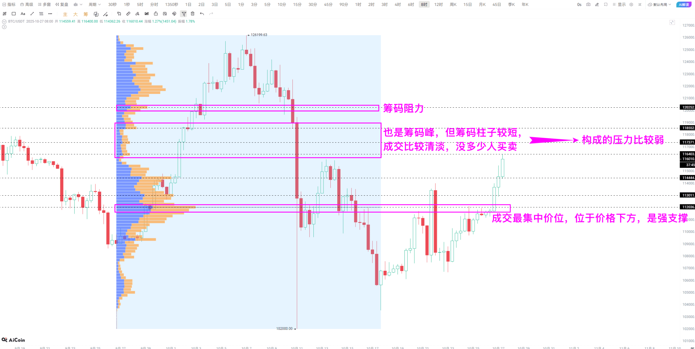
Another trick for looking at chip peaks is to find those "tall" peaks. Short chip peaks indicate low transaction volume and low consensus among traders, meaning the support and resistance forces are insufficient. Select a segment of rising or falling market conditions, use the interval chip distribution tool to draw it, and the situation will become clear immediately.
Looking at the cycle depends entirely on personal habits: short-term players can focus on chips for 1 to 3 days, medium-term can look at 1 to 2 weeks, and long-term should look at over a month. For example, in my previous analysis of BTC, I looked at the chip data based on the last three months of K-line. If you are used to looking at short-term 15-minute charts, then just use the chip chart for the 15-minute cycle; whatever feels comfortable works.
Join our community to discuss and grow stronger together!
Official Telegram community: https://t.me/aicoincn
AiCoin Chinese Twitter: https://x.com/AiCoinzh
OKX benefits group: https://aicoin.com/link/chat?cid=l61eM4owQ
Binance benefits group: https://aicoin.com/link/chat?cid=ynr7d1P6Z
This article only represents the author's personal views and does not represent the platform's stance or views. This article is for information sharing only and does not constitute any investment advice to anyone.
免责声明:本文章仅代表作者个人观点,不代表本平台的立场和观点。本文章仅供信息分享,不构成对任何人的任何投资建议。用户与作者之间的任何争议,与本平台无关。如网页中刊载的文章或图片涉及侵权,请提供相关的权利证明和身份证明发送邮件到support@aicoin.com,本平台相关工作人员将会进行核查。


