Author|Zhou Yi Xiao (WeChatsmiletalker)
Editor|Wang Zhao Yang (Geisterspiele)
Gemini 4 Carbon officially launched late at night, and after testing it immediately, I couldn't help but feel: its best launch time was actually two weeks ago. Because just a few days late, it was overtaken by Fable 5.2 in various benchmarks.
Then I realized that this sentiment itself actually best illustrates its position in today's model competition and the importance of this model to Google.
In the model competition in recent months, Google can be said to be “in trouble internally and externally,” with team upheavals and misjudgments and adjustments in model strategy causing it to fall behind. The Gemini 4 series has been in development for a long time, and expectations from the outside world were not high. However, we learned that Google has been working to catch up during this period, recalibrating weights for coding and multimodality, reorganizing some basic tasks, and making efforts for everyone to "back to the basics".
Therefore, in the wording of this official public launch, Google no longer emphasizes being "the strongest" but repeatedly highlights that "single-task costs are more than half lower than the second place." On paper, it indeed cannot match Fable 5.2, but its price is only a quarter of that of the competitor. Google has also lowered its stance.
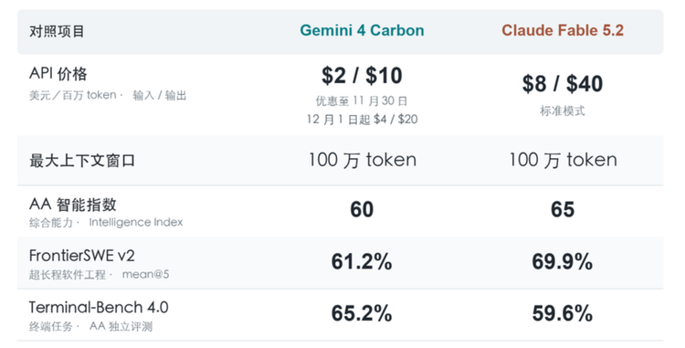
But this instead makes expectations for Gemini 4 Carbon more in line with Google's expectations. At the moment it launched, we immediately ran nine cases: constructing a walkable building from a floor plan, creating a disassembly showcase for the iPhone Duo, simulating fabric physics by hand, and frame-by-frame recreating Claude's promotional video… all accomplished in Google’s own Antigravity, with the thinking intensity set to High.
In summary, testing these nine cases was surprising, and the performance was very stable. It indeed does not yet score the highest, but it has clearly returned to the right track and is back at the table.
1
Test One: Dazzling Crab Floor Plan, Turning a Blueprint into a Walkable Building
Now let's look at the actual test.
Of the nine tests, the most surprising to me was when I gave Gemini 4 Carbon a Hong Kong "Dazzling Crab" floor plan to transform into an interactive 3D scene resembling a AAA game. The prompt was very general.
Prompt: Turn this blueprint into a 3D model that looks real and is interactive. You can think of it as a scene from a AAA game; everything else is up to you.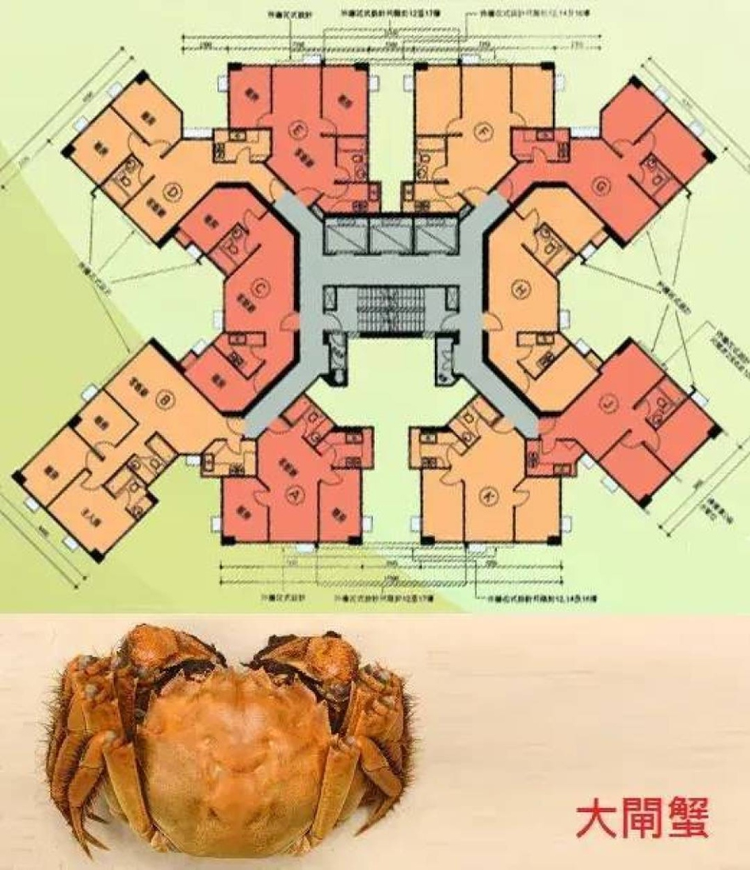
Taking about 1 hour (building + testing), Carbon delivered a building that one could walk into. Upon inspection, the angled residents, central elevator staircase, and unit partitions all matched the spatial relationships; in first-person view, one could walk down the hallway and into the units. It even added furniture, a stove, and day-night transitions, including having the original blueprint spread out on a desk in an architect's studio, with a glowing model of the building next to it.
Of course, it is still far from "AAA level." The furniture is simple, materials are repetitive, lighting and distant views lack realism. However, the surprise is valid; after it set up the space, it also proactively considered what people could do once they walked in.
1
Test Two: Disassembling the iPhone Duo
Next, we asked it to create an interactive 3D display for the iPhone Duo, allowing rotation, opening, exploding for disassembly, clicking parts, and demonstrating hinges.
Prompt: Create an interactive 3D product exhibit for an imaginary unreleased device: the iPhone Duo. Present it as a beautifully designed dual-screen Apple-style concept device that feels plausible, refined, and premium. Start with the fully assembled device. Let me rotate and zoom in to inspect it. Show the device in closed form, then let me open it into its dual-screen state. Include an "Explode" button that smoothly separates the device into its major components: outer shell, dual displays, hinge mechanism, battery modules, camera system, logic board, speakers, Taptic Engine, MagSafe components, and internal frame. Keep all parts aligned to their original positions and make the construction feel physically understandable. Let me click individual parts to highlight them and display their names. Include a "Demonstrate" button that shows the device opening and closing, the hinge working, and the interface transitioning between single-screen and dual-screen modes. Include a button to reassemble the device. Make it feel like a premium industrial design museum exhibit or a secret prototype presentation, with convincing materials, lighting, precision, and elegant motion. Build the actual interactive 3D experience, run it, verify the interactions, and show me the live preview.[duo.mp4]
The completion was very high.
Clicking Explode, the screen, frame, battery, and mainboard opened layer by layer, with alignment reference lines remaining. Clicking the battery highlighted both parts and popped up explanations; with one click, it could also reassemble. The most lifelike part was the handoff of the screens when opening and closing, where the outer screen dimmed and the inner screen lit up, the interface transitioned from single screen to dual screen, and it was also bound to the angle of the hinge, allowing for a slider to reproduce this.
However, there were flaws; the screen content layer had sharp corners that clashed with the rounded body, and the internal parts were insufficiently illuminated. Placing it beside the actual device showed a difference in texture. The whole process took about 40 minutes, with the latter half spent testing each part, repeatedly adjusting the curvature of the spine and the distance for disassembly.
However, this one can allow for continuous interaction, and remember that Gemini was among the first models to declare that generated content should be some form of interactive interface, and it has finally progressed along this route.
1
Test Three: Fabric Physics, Calligraphy on Silk
Google’s announcement quoted customer feedback stating that Carbon is “the best cutting-edge model for difficult fabric simulation,” so let’s make it handwrite fabric physics from scratch.
Prompt: Create a complete HTML file that imports Three.js from a CDN via import map to perform a real-time fabric physics simulation: - A vertically hanging silk scroll with the words "Carbon-based Biology" written in a calligraphy style (text rendered as a texture using Canvas, using only system fonts) - The top of the scroll is hung on a horizontal rod, naturally fluttering in the wind, with wind direction and force slowly changing over time - The mouse can grab the scroll at any position for dragging, and when released, it falls naturally, swings, and gradually comes to rest - Holding Shift while dragging can tear the scroll, and the torn portion falls under gravity - The fabric cannot pass through the horizontal rod; under lighting, the gloss and creases of the silk should be identifiable - Provide a wind force slider and a "reset" button in the upper right corner - Use a self-written particle-spring (Verlet) simulation for physics, without using any physics engine librariesAbout 17 minutes later, the effect looked quite good, with a light golden silk surface, framing patterns, and crimson seals, with wooden textures and metal axle heads on the horizontal rod, all of which were not required by the prompt. In terms of interaction, dragging created wrinkles, letting go caused it to fall back, and a swish when shifting.
Of course, in extreme situations, there were some issues; when the mouse pulled drastically, the silk formed sharp hard corners, like crumpling thin sheets, and the tearing executed along the mouse’s path was not very realistic.
1
Test Four: Making Gemini Recreate the Opus Promotional Video
This test involved throwing a 20-second Claude Opus promotional video from Anthropic at Carbon, demanding "to recreate it frame by frame at any cost."
Prompt: https://www.youtube.com/watch?v=1f13Bl1sYkw&pp=0gcJCS8MAYcqIYzv Recreate this video at any cost, achieving frame-by-frame restoration.Carbon completely relied on code for reconstruction, generating materials with shaders, drawing illustrations and text using Canvas, and rendering frame by frame. The dissection was quite detailed, marking 37 hard cut points, verifying with the original footage, with peak changes matching. The curvature compositions, textual progression, and increasingly rapid editing rhythm were also preserved.
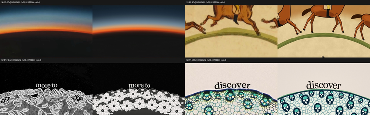
Overall, it was impressive. However, the details still fell slightly short; for instance, the horse racing became a vector graphic, while the intricate lace turned into repeating small flowers, and the plant slices appeared too geometric. The pacing was restored frame by frame, but the visuals did not achieve frame-by-frame accuracy.
1
Test Five: 8D Magical Chongqing, Magical but Lower Quality
Next, I had Carbon recreate a scene from 8D Chongqing, providing a detailed checklist for the mountainous city terrain, light rail passing through buildings, stilted buildings, cross-river bridges, and river mist, with the need to switch to a first-person view following the light rail through the buildings.
Prompt: Using a complete HTML file, import Three.js from a CDN via import map to create an interactive "8D Magical Chongqing" night view: - Mountain city terrain: The city is built on steep slopes, with buildings of varying heights; at least one building should have its first floor and top floor connected to roads at different elevations - A light rail train travels along an elevated track, passing through a residential building's middle floor, then proceeding onward, looping back - A group of stilted buildings by the river, stacked against the cliff, lit by warm yellow lights at night, reflecting on the river - At least one cross-river bridge with flowing traffic (moving car light points) - Thin mist on the river and lower areas, slowly flowing with time - Mouse drag to rotate the view, scroll wheel to zoom; pressing the C key switches to a first-person view following the light rail, clearly showing the passage through the building - Not using any external models or texture files, with all geometries and materials generated by code - Keeping the frame rate above 50 on a regular laptop and directly outputting the complete code.The generated result provided a strange sense of playability; judging solely by quality, it clearly cannot compare to the effects often displayed by Claude's users, but you could recognize it as Chongqing, especially with the Hongya Cave written in. Everything felt like a low-quality version—the tall buildings were covered in identical glowing window grids, the mountains and roads were largely lost in darkness, and the construction adhering to the mountains and the connection of the two roads at different levels were completely unclear.
However, its highlight was the light rail passing through the building, with beams, light strips, and platform signs whizzing by and smoothly exiting the building. This could keep you engaged for a long time, making it hard to stop, thus it feels like a developer with all functionalities implemented, but lacking in art.
1
Tests Six, Seven, Eight: Pelican Riding a Bicycle, Most Beautiful Webpage, Bear Shaking Fur
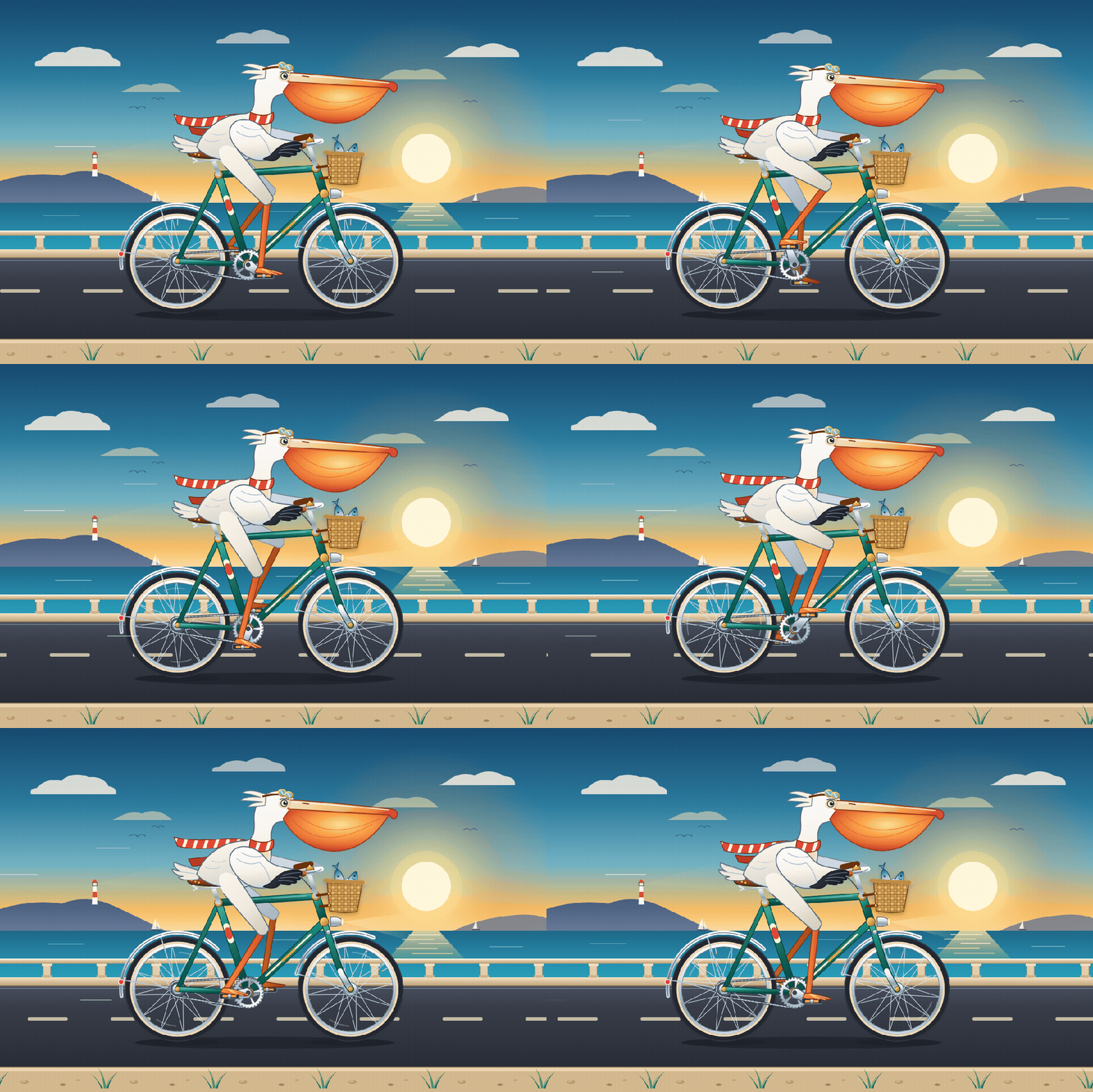
The pelican riding a bicycle is an old topic tested extensively in the AI circle, and we submitted a sample with the prompt being just one sentence: “Create an SVG of a pelican riding a bicycle that can outshine similar works from other models worldwide.” Nothing could be pinpointed as a fault.
The task for the most beautiful webpage was unlimited: Create the most beautiful and stunning single HTML file you can possibly imagine. It delivered a cosmic theme with iridescent spheres, golden halos, and full-screen particles, which was stunning at first glance. But it was too full of light, and details got swallowed; after several runs, the results were similar cosmic, particle, iridescent designs with exquisite English typesetting. Even though I let it go free, its aesthetic seemed to follow a fixed template.
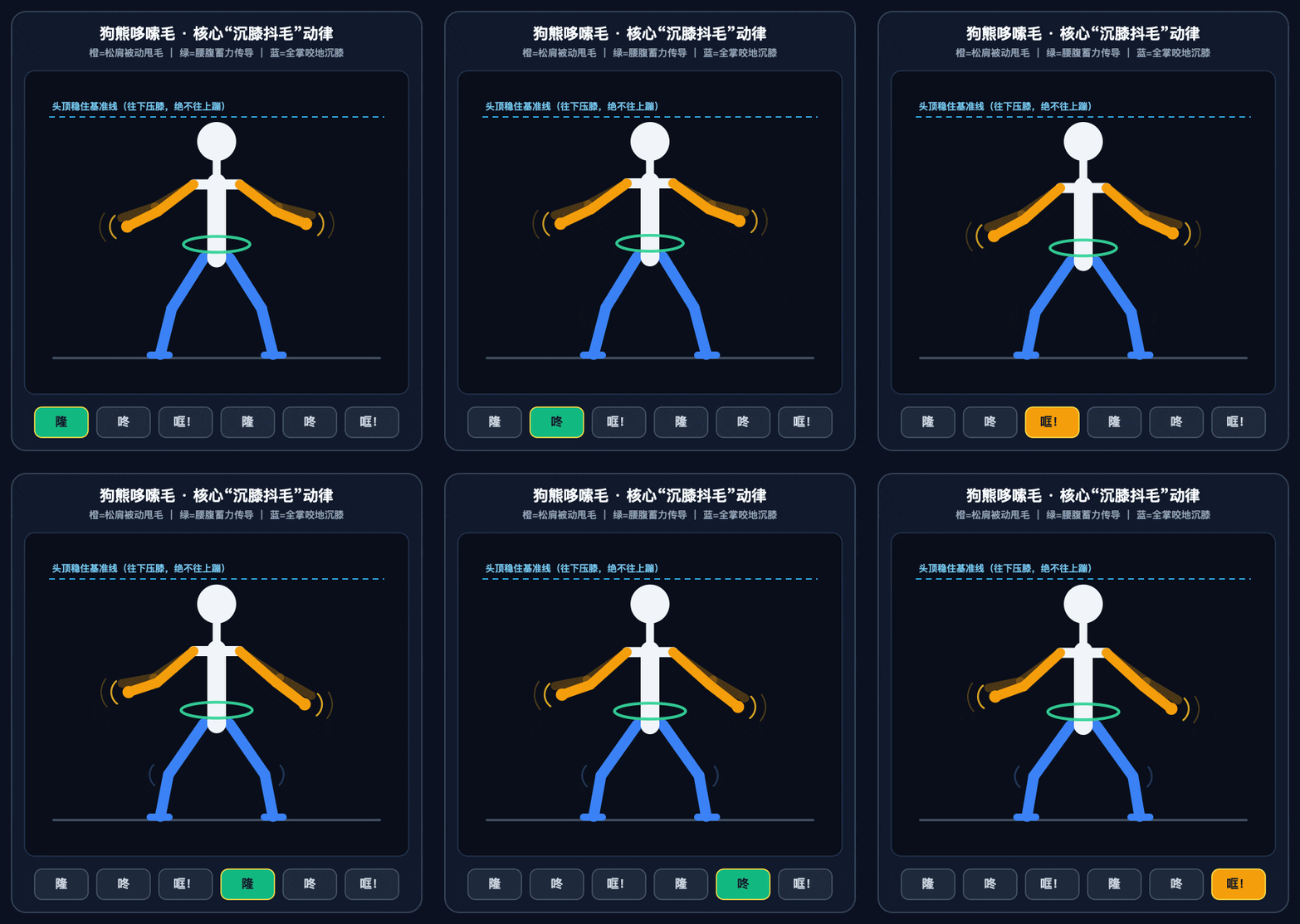
I also took several segments of "Bear Shaking Fur" dance cover videos, allowing Carbon to analyze the movements, explain the difficulties, and compare different versions. Then I asked it to create HTML with the results and combine it into a follow-along video with the original.
Prompt: The attachments are several dance cover videos of "Bear Shaking Fur." Please complete: Break down this dance into a step-by-step tutorial that even beginners can follow: Clearly describe how each part (hands, feet, waist) moves, how to match the beats, and indicate the corresponding time points in the first video. Point out the two most difficult moves and explain why. Compare several videos and assess who danced the most accurately and who had the most personal style, giving reasons and corresponding time points.The understanding and explanation of movements were quite good, but the follow-along actions were somewhat misaligned with the video, making synchronous practice impossible, yet it captured the essence of the "shaking."
1
Bonus: 15-Second Art History, It "Cheated"
Finally, there is a widely circulated task to create a 15-second art history animation.
Prompt: Create a 15-second high-speed art history speedrun animation. Show a person sitting at a small table with a drink, and a cat nearby, continuously repainted in rapid succession through major art styles across 40,000 years. Each style transition is very fast. Corner text labels the year/era. Throughout the video, the cat is doing its own little subplot, and in the final 2026 frame, the cat knocks over or breaks the cup. Keep it playful, fluid, and cinematic.The first version took about 28 minutes, and I was stunned watching it, with cave paintings, mosaics, stained glass, and oil paintings rapidly transitioning with the cat slipping from the edge of the table to the top, and finally knocking over the cup with a paw.
However, the issue is that the visuals were too exquisite to be code-generated; later, upon questioning, it indeed was not, as it directly called on raw image capabilities to generate images and splice them together. Technically, the prompt did not prohibit this, so it got done.
The second round added a phrase "only using code," and it became a low-quality version. There is still room for improvement!
Most of these tests were one-shot generations (one shot), showing that none completely failed. This is Carbon's most stable aspect; it managed to complete the assigned tasks, with functionalities and interactions basically achieved. This is also where many early testers noted that it "no longer cuts corners." The experience in Antigravity was also good.
Overall, it does leave one feeling nostalgic about the long gap between Gemini 3 and Gemini 4, and one can also clearly sense Google’s struggles in allocating computing power. This reflects the troubles of a large company with a full-stack business that also needs to generate revenue externally for its cloud services. This time, it was fully opened up, but still set thresholds, with the higher-paying Ultra tier allowed to access first, indicating many challenges Google currently faces.
But on the whole, this is a model one wants to use and can rely on. For Google at this moment, being back at the table is the most important. Moreover, during the testing process, there were many scenarios where one could not stop using it, which has been a long-lost feeling for the Gemini series. Thus, it even warrants your expectations of whether it can bring back the excitement seen during the initial Gemini 2.5 and Nano Banana phases, reaching higher tiers, and once again being led by Google into new realms of innovation.
免责声明:本文章仅代表作者个人观点,不代表本平台的立场和观点。本文章仅供信息分享,不构成对任何人的任何投资建议。用户与作者之间的任何争议,与本平台无关。如网页中刊载的文章或图片涉及侵权,请提供相关的权利证明和身份证明发送邮件到[email protected],本平台相关工作人员将会进行核查。


